Beginner Brush Calligraphy Setup: Pen, Paper, and Practice
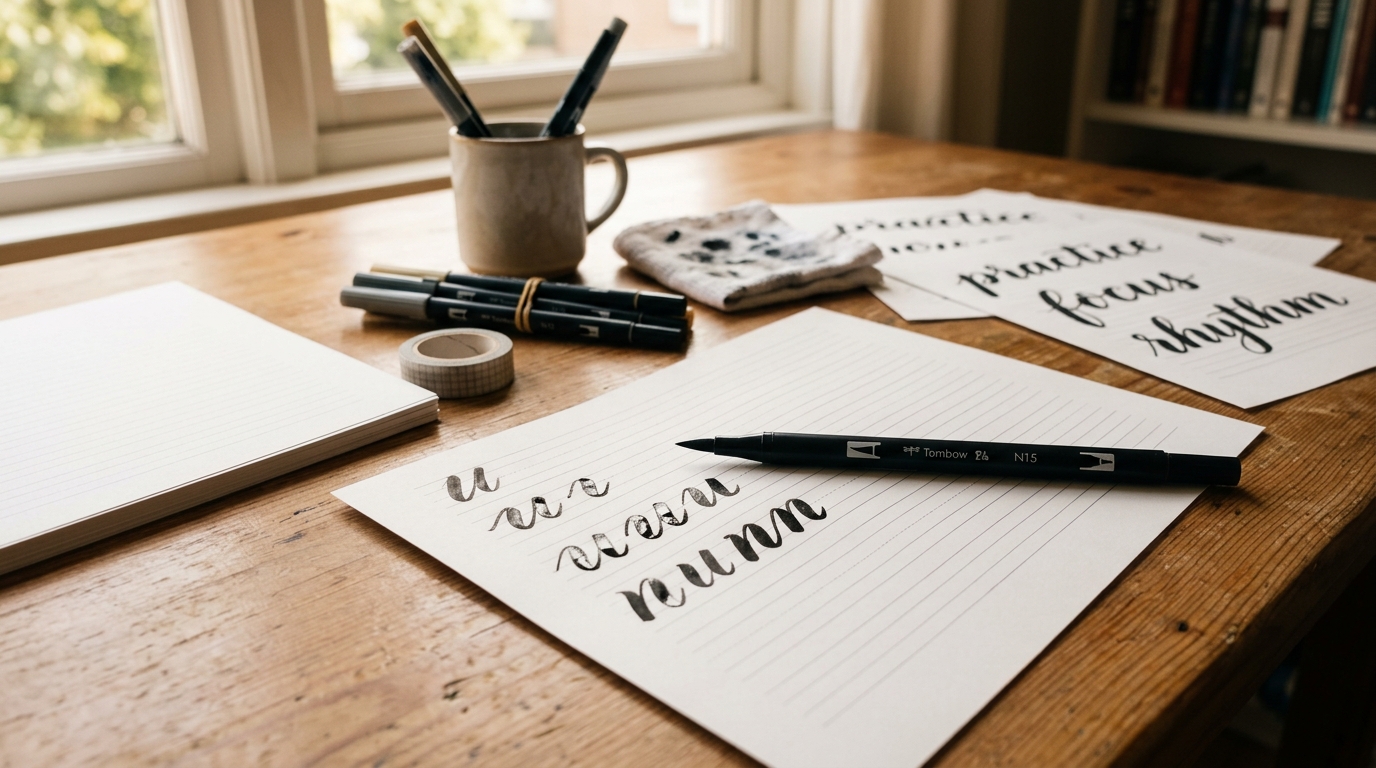
The Core Kit: Pens, Paper, and a Pencil
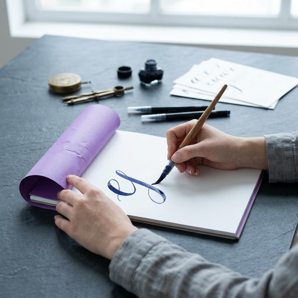
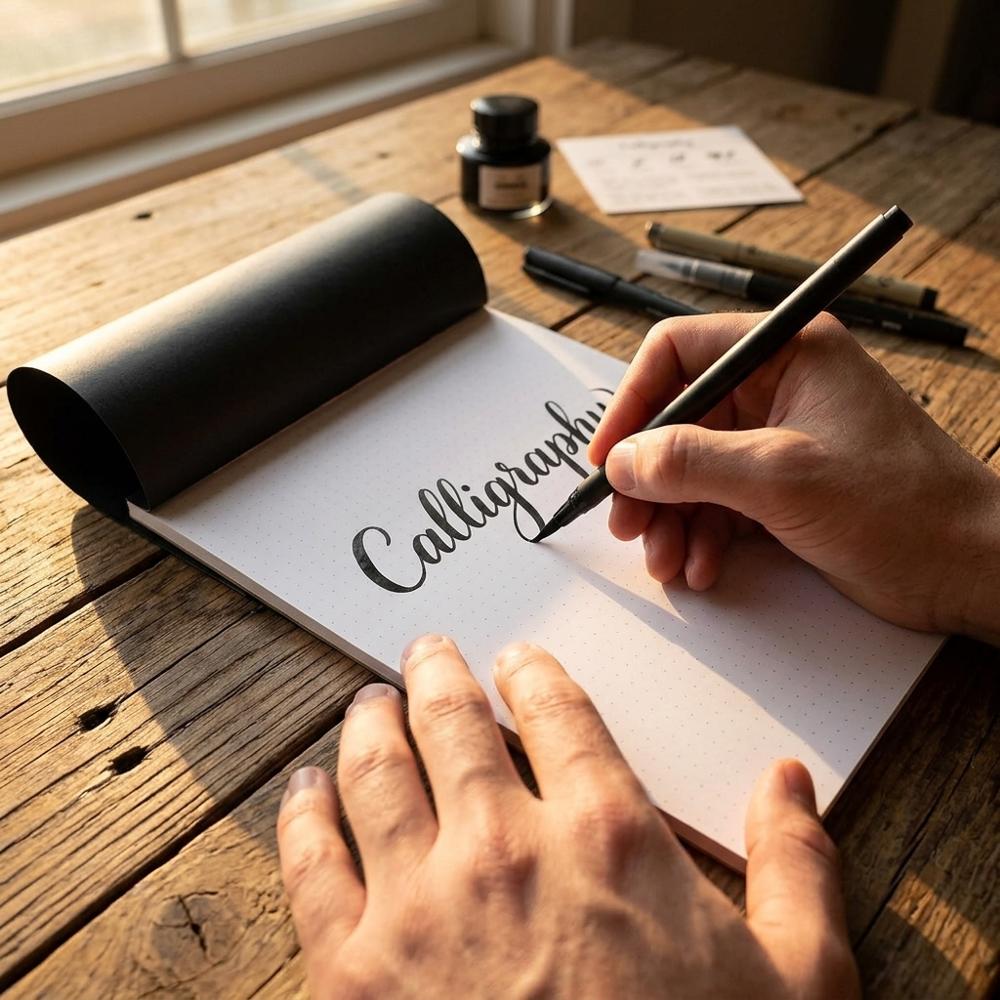
The first thing that surprises most people about brush calligraphy is how fast the tool punishes the wrong paper. Drag a brush pen across ordinary printer paper a few dozen times and the felt tip starts to splay and fuzz, and crisp hairlines turn ragged. So the starting kit is really a pairing problem: a flexible pen that bends under pressure to give you thick downstrokes and thin upstrokes, and a surface smooth enough to keep that tip intact. Add a pencil for ruling guidelines and you can write your first letters the same afternoon. I keep this separate in my head from the difference between calligraphy and drawn hand lettering, because the two get muddled constantly — brush calligraphy is written in single, pressure-controlled strokes rather than built up outline by outline.
My rule for starting is to buy the smallest pile of supplies you can and then practice until something actually runs out. For brush calligraphy that bare minimum is one firm-tipped brush pen, a pad of smooth paper, and a pencil with an eraser for guidelines. Color, blending tools, and watercolor brushes are all genuinely fun, but none of them will teach you the basic strokes any faster.
The picks below were chosen after weighing the supplies beginners get steered toward most often, keeping only the ones that are easy to find, forgiving to learn on, and priced so a frayed tip or a ruined page never feels like a real loss.
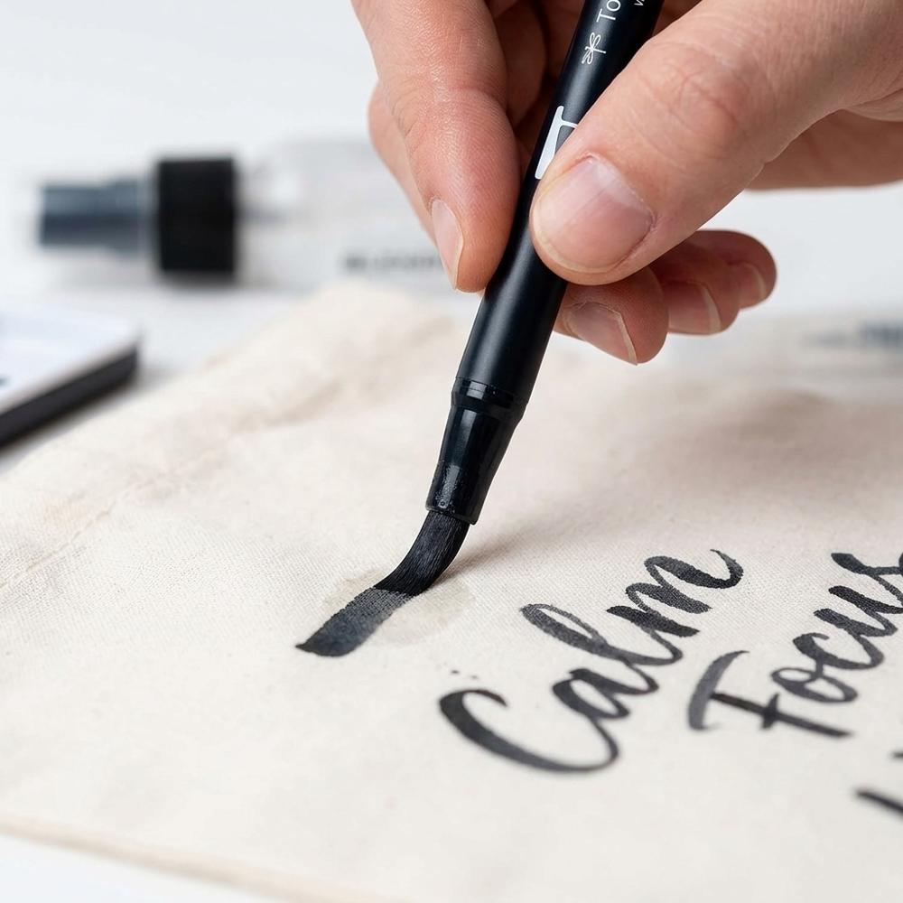
Firm-tip brush pen for controlled calligraphy strokes
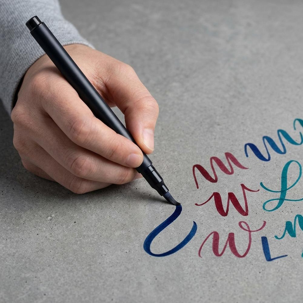
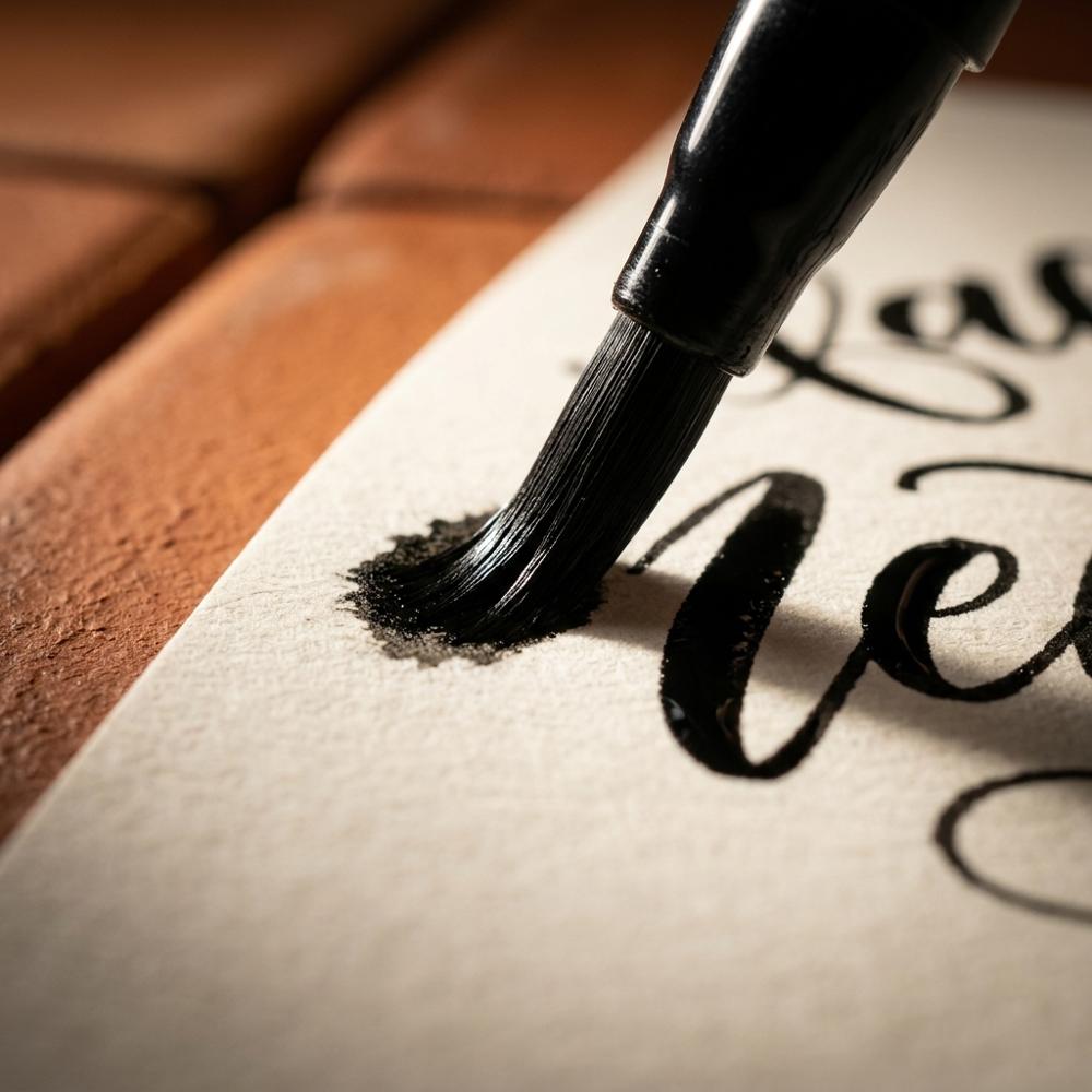
A pen with a small, firm brush nib that flexes just enough under pressure to switch between thin upstrokes and thick downstrokes. The compact, springy tip gives beginners more control and steadier lines than a large soft brush, which is why it is the standard tool for learning the basic strokes. Look for a water-based ink that resists bleeding and a tip that keeps its point rather than splaying.
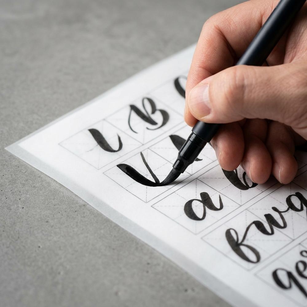
Large flexible brush pen set for learning letterforms
Bigger marker-style pens with a long, flexible brush tip on one end and a fine bullet tip on the other. Writing large with a soft, expressive tip helps beginners feel the shape of each letter and the swell of a downstroke, and the blendable water-based inks invite early color work. The two-ended design also doubles as a detail pen for smaller pieces.
Smooth bleedproof marker paper for brush pens
A pad of thin, very smooth, semi-translucent paper made to take marker and brush-pen ink without feathering or readily bleeding through. The slick surface is what protects brush tips from fraying and keeps your hairlines crisp. Beginners should weigh smoothness and a generous sheet count over paper weight, since practice burns through pages quickly.
Graphite pencils and erasers for ruling guidelines
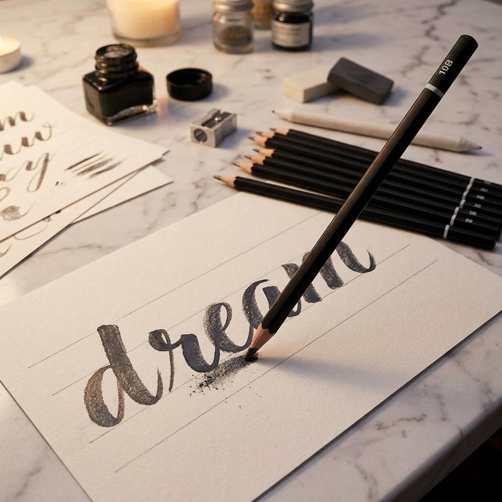
A set of graphite pencils paired with a kneaded eraser, a vinyl eraser, and a sharpener. In brush calligraphy the pencil rules light baseline, x-height, and slant guides, and the erasers lift those marks once the ink has dried. A kneaded eraser is especially handy because it removes graphite without scuffing the paper or smearing the ink.
With these four things on the desk you have everything you need to drill the basic strokes and write your first words. Expect your early downstrokes to wobble and your spacing to drift; that is normal, and a pencil baseline corrects far more of it than any pen upgrade will. If the meditative feel of ink moving across smooth paper hooks you, it often spills over into related pursuits like getting started with fountain pen writing, which shares the same fussiness about paper and ink.
Tools That Make Practice Stick
Once the basic strokes stop feeling alien, the thing that slows most beginners is inconsistency — letters that lean at different angles, baselines that sag, words that crowd together at the end of a line. The supplies in this group all attack that problem rather than adding new abilities. Guide sheets, a dot grid, a ruler, and a stack of see-through tracing paper turn vague practice into measurable practice, which is where steady progress actually comes from. Much of this gear overlaps with a beginner hand lettering kit, so if you drift between the two styles nothing here goes to waste.
Modern calligraphy practice workbook with guide sheets
A beginner workbook that walks through the basic strokes, shows the alphabet broken into numbered pen movements, and supplies ruled pages to trace and practice on. Working through structured drills builds the muscle memory that aimless doodling never quite does. The better ones separate each letter into its component strokes and leave room to repeat them many times.
Smooth dot grid pad for spacing and slant practice
A pad of smooth, ink-friendly paper printed with a faint dot grid in place of solid lines. The dots act as quiet guides for letter height, spacing, and slant, then mostly disappear in a finished piece. The smooth surface also keeps brush tips happy, so it serves for both planning and practice.
Transparent graph ruler for ruling baselines
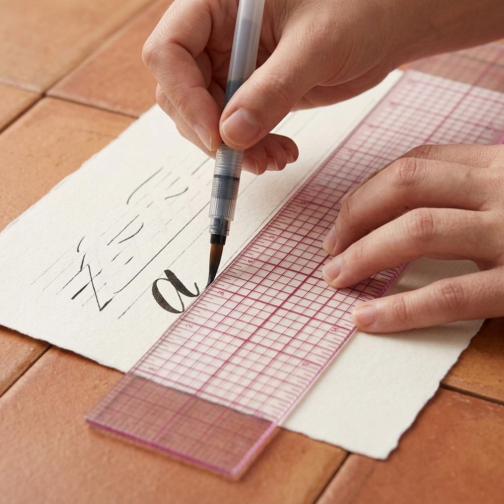
A clear plastic ruler printed with a grid so you can rule parallel baselines, x-height lines, and angled slant guides accurately. Its transparency lets you align against marks or letters underneath. For calligraphy you want fine, evenly spaced guide lines, which a gridded ruler makes quick to lay down.
Translucent tracing paper for layering over guides
A pad of thin, see-through paper smooth enough for brush pens. Laid over a guide sheet or a piece you admire, it lets you trace letterforms repeatedly until the shapes feel natural, then move to blank paper. Tracing is one of the most effective and least glamorous ways to absorb good letter structure.
None of these are mandatory, and I would resist buying all of them at once. A common trap is hoarding more practice material than you will ever fill — pick the workbook or the dot pad first, work through real pages of it, and add the rest only when you feel the specific need. Layering tracing paper over a guide sheet is the single habit that improved my own letterforms fastest, and it costs almost nothing.
Adding Color, Blends, and Finishing Touches
Color is where brush calligraphy starts to look like the pieces that probably drew you in — a smooth gradient inside a single word, a soft watercolor wash behind a quote, a crisp white flourish on dark paper. These tools unlock that look, but they reward a steady hand, so they are worth adding only once your strokes are reliable. Decorative lettering like this is also what gives a beginner bullet journaling setup its headers and accents, so the skill carries straight over into everyday pages.
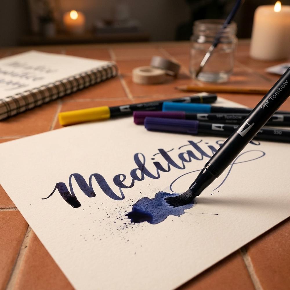
Watercolor brush pens with real flexible bristles
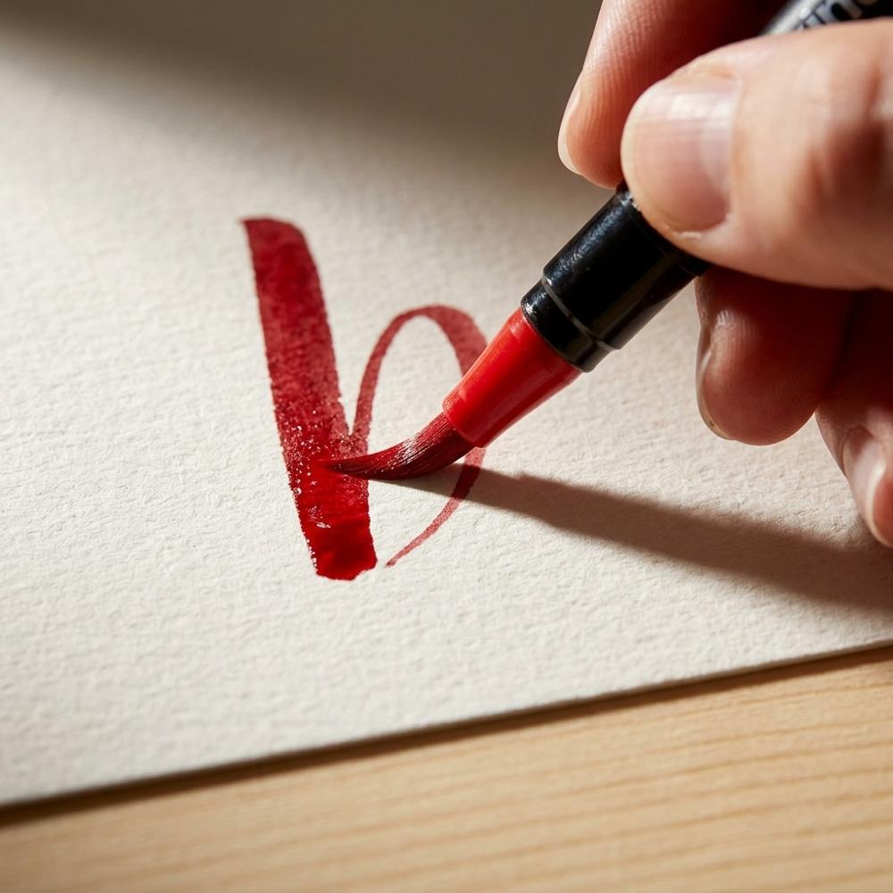
Brush pens fitted with soft, real-style nylon bristle tips and water-based dye ink that behaves like watercolor, so you can blend colors, fade them with water, and build gradients. They bridge brush lettering and painting, letting you letter and wash color with one tool. Beginners should expect a steeper control curve than felt-tip pens, since a bristle brush is far more flexible.
Refillable water brushes for blending and washes
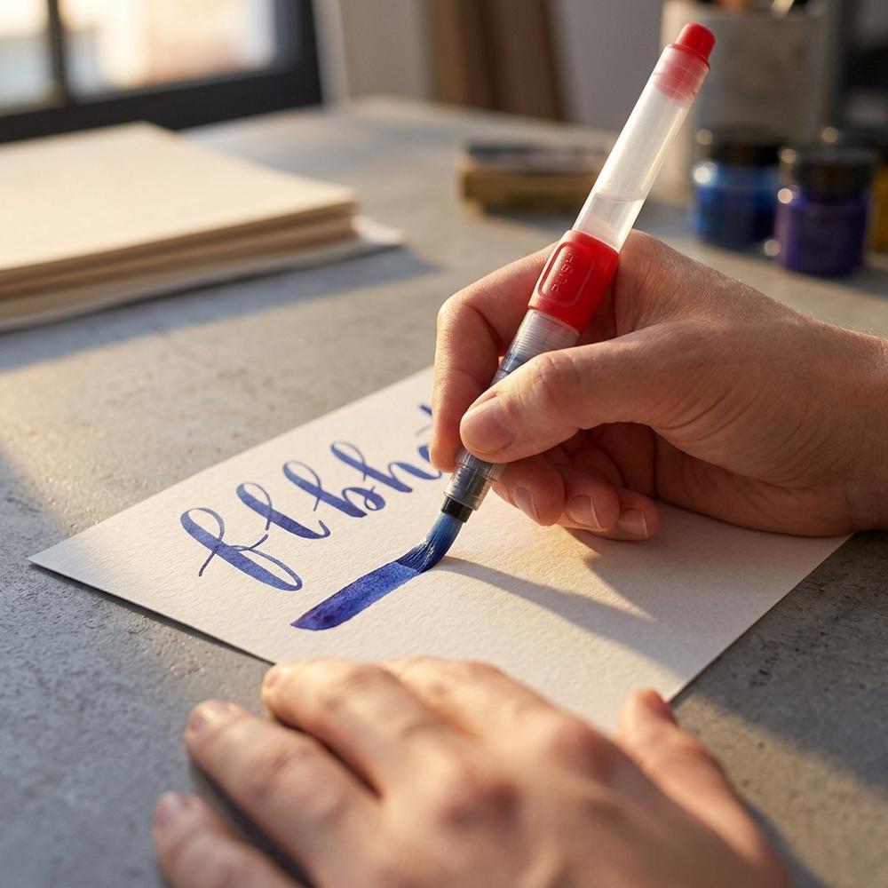
Pens with a barrel you fill with water and a soft brush tip that releases it as you squeeze. They soften and blend brush-pen ink, pull a color into a gradient, or lay a light wash without dipping into a jar. A range of tip sizes handles everything from fine detail to broad fills.
Blending palette and colorless blender for gradients
A small kit with a non-porous palette, a colorless blender pen, and a fine mister. You scribble brush-pen ink onto the palette, pick it up with a blender or wet tip, and create smooth two-tone blends within a single word. It is purpose-built for the ombre lettering look without full watercolor gear.
Opaque white gel pen for highlights on lettering
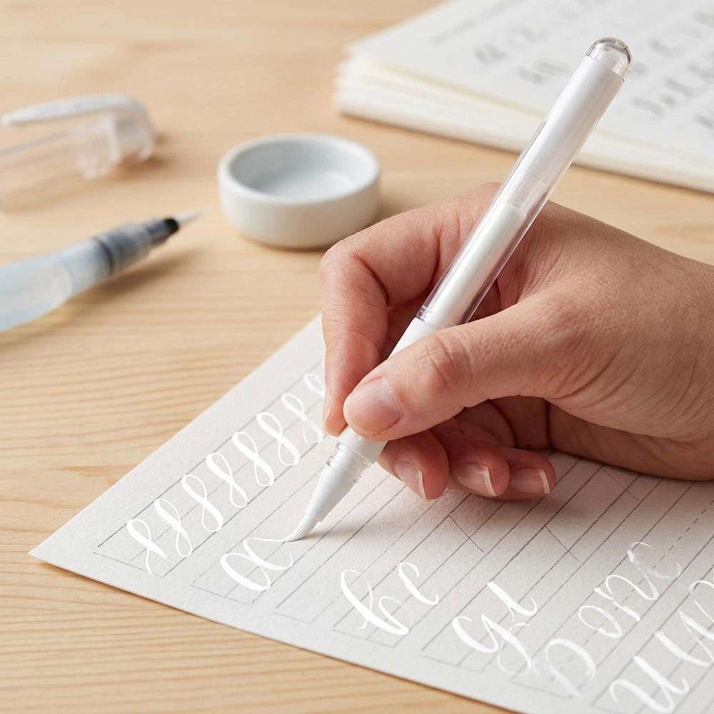
A gel pen that lays down thick, opaque white ink that shows up on dark or colored paper and over dried ink. Letterers use it for fine highlights along downstrokes, dots, and flourishes that make a finished piece pop. Look for a broad point and genuinely opaque ink, since thin or translucent white just reads as gray.
With color pens, a water brush, a blending palette, and a white gel pen you can move from plain practice strokes to finished, framable pieces. Go slowly here — beginners almost always over-saturate their blends and end up with muddy puddles before they learn how little water it actually takes. Brush calligraphy is also one of the gentler entries on most lists of good starter hobbies for adults, precisely because the results look rewarding long before the technique is polished.
The Questions Every Brush Letterer Asks by Week Two
Why do my downstrokes look shaky no matter how slowly I go?
Most beginners try to write brush calligraphy with finger movements, the way they hold a normal pen, which makes long downstrokes jittery and cramped. The fix is to move from the whole arm and shoulder and to slow down even further, because brush lettering is closer to controlled drawing than to fast handwriting. Lift the pen between strokes instead of writing each letter in one continuous motion, and the wobble usually settles within a few practice pages.
My brush pen suddenly writes scratchy and pale — did I get a dud?
Almost always the pen is fine and the paper did the damage. Practicing on rough or uncoated paper frays the felt tip and drinks the ink, so the pen feels dry and the fine lines go feathery. Once a tip has splayed it rarely fully recovers, which is why smooth paper matters from day one; keep a frayed pen for rough scribbles and start fresh ones only on the good paper.
How hard should I actually press to get the thick part of the stroke?
Beginners tend to mash the pen flat hoping for a bold downstroke, and instead they crush the tip and get blobby, uneven lines. Pressure should change gradually within a single stroke — light on the way up, easing into firmer on the way down — not slammed on all at once. Treat it as a dial you turn rather than a switch you flip, and let the tip's natural flex do most of the work.
Why does my lettering look crooked even when each letter looks fine?
This is almost always spacing and consistency rather than the letters themselves. New letterers concentrate so hard on forming each character that they ignore the rhythm between them, leaving uneven gaps that read as messy. Lightly ruled guidelines and a consistent slant angle fix this faster than more letter drills, so rule your lines before you write and watch the spaces between letters, not just the strokes.
Should I learn on the big flexible pen or the small firm one first?
People often assume the large, very flexible pens are the easy beginner choice because they look impressive, but their soft tips are harder to control and exaggerate every mistake. A small, firm tip gives steadier lines and clearer feedback while you learn the strokes, and the larger pen becomes far easier once your pressure control is in place. Starting big is the most common reason beginners decide they have no natural talent when they have really just picked the harder tool.
Love what you see here? Save individual picks with ⋮ on any item, or copy the whole list to your own wishlist in one click — great for coming back to later, or dropping as a not-so-subtle hint.
 A Few More Beginner Setups We Carefully Put Together
A Few More Beginner Setups We Carefully Put Together
Beginner Gouache Painting Setup: Core Supplies Checklist

Paint by Numbers Relaxation Setup
Disclosure: Some product links may be affiliate links. If you make a purchase through one of these links, we may earn a small commission at no extra cost to you.