Beginner Hand Lettering Setup: Tools for Your First Letters
Everything It Takes to Draw Your First Letters
The thing that surprises most people is that hand lettering is drawing, not handwriting — you build each letter up stroke by stroke, sketching and refining the way you would a small illustration. That single shift is also where the confusion starts, and it helps to understand how calligraphy and hand lettering actually differ before you spend a cent, because the two crafts reward different tools and habits. For lettering itself you need very little: something to sketch with, smooth paper that won't chew up your pens, a pen that gives you thick and thin strokes, and a way to keep your baselines straight. I would resist the urge to buy a forty-piece set on day one, since a handful of the right pieces will carry you much further than a drawer of mediocre ones.
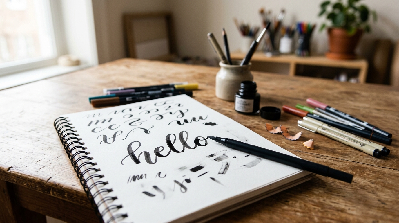
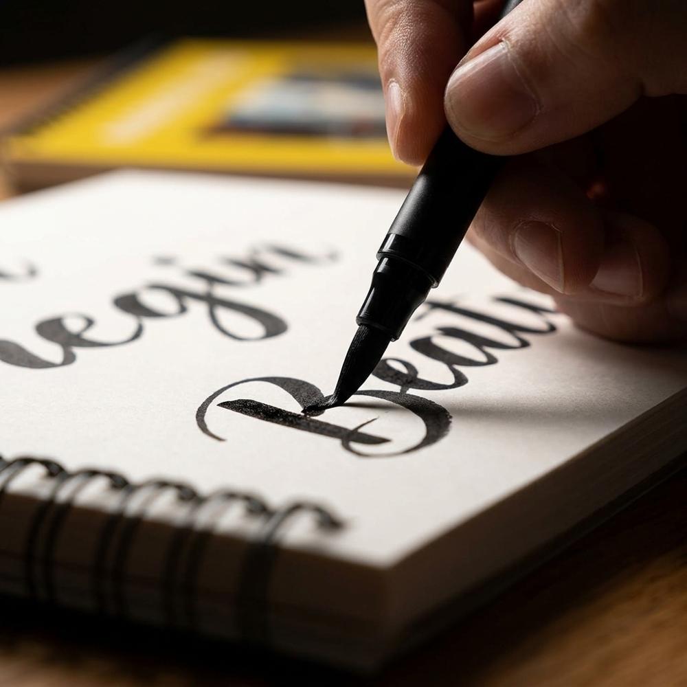
Soft-tip brush pen for thick-and-thin lettering strokes
A felt brush-tipped pen that flexes under pressure, laying a thin line on the upstroke and a broad one when you press into a downstroke. The flexible nib is what creates the stroke contrast that defines lettering, and a soft tip gives more dramatic swells than a firm one once your hand settles. Beginners should look for a tip that springs back to shape rather than splaying out, and a water-based ink that won't bleed on smooth paper.
Smooth bleedproof marker paper pad for brush pen practice
A pad of dense, coated paper milled smooth enough that a brush tip glides instead of catching. The smoothness does two jobs: it protects the delicate fibers of a brush pen from fraying, and it stops ink from feathering or bleeding through to the next sheet. Look for paper described as marker or bleedproof in the 70gsm-and-up range, ideally with enough sheets to practice without rationing.
Graded graphite pencils for sketching letterforms
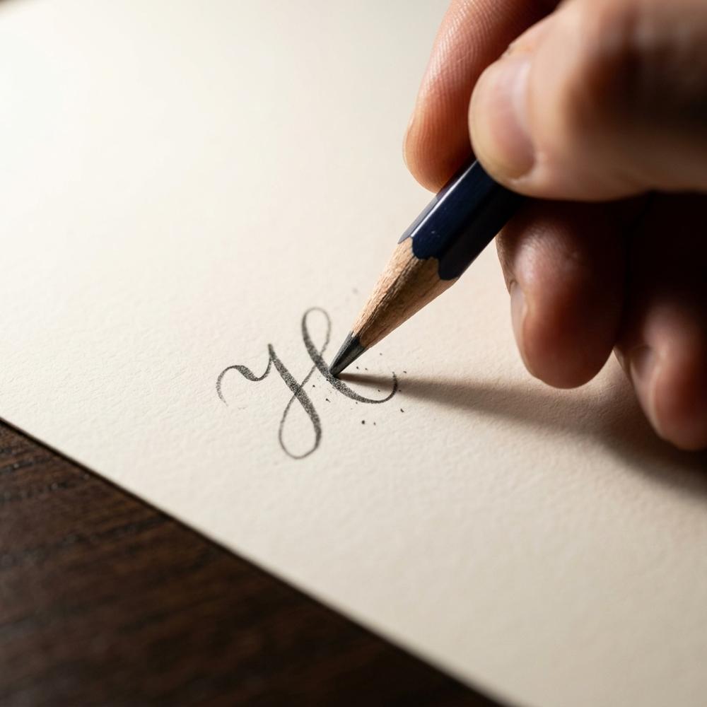
A set of wood pencils in a range of graphite grades, from hard and pale to soft and dark. Lettering almost always begins as a light pencil skeleton that you refine before any ink touches the page, and a harder grade keeps those guide marks faint enough to erase cleanly. A small graded set covers both light construction lines and darker shading without buying singles.
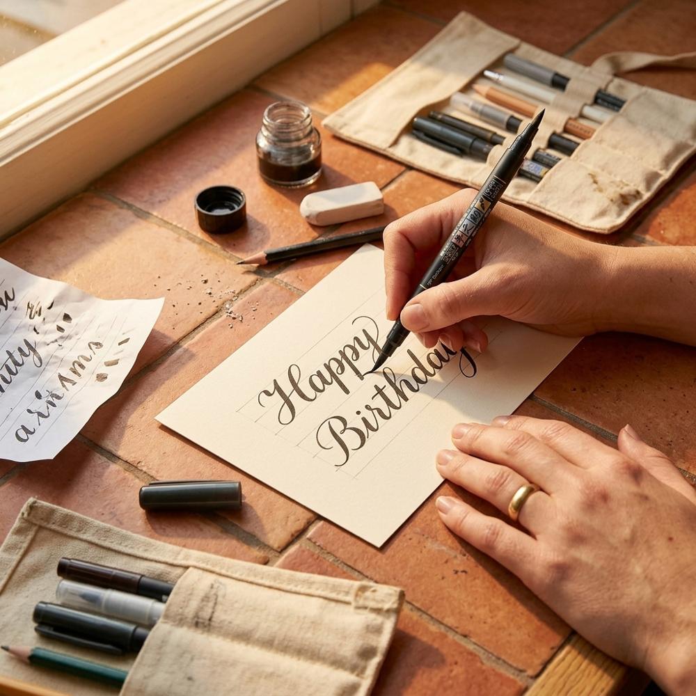
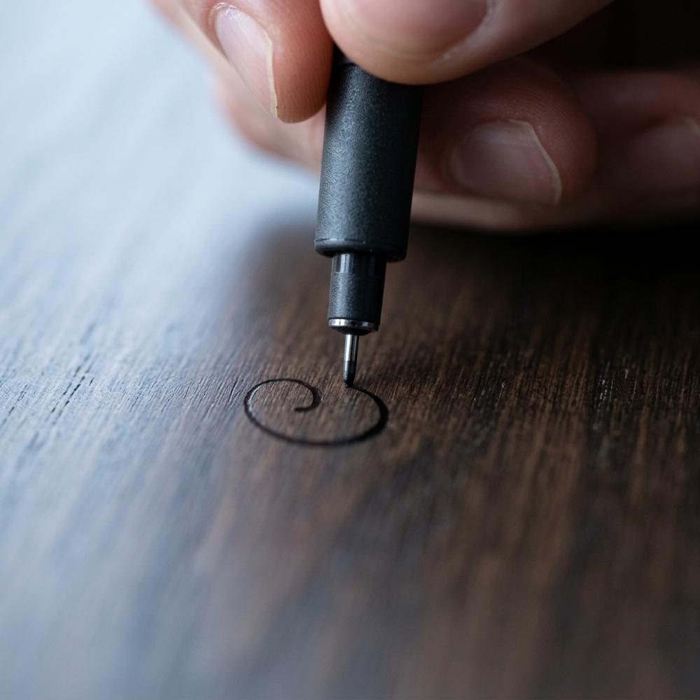
Archival pigment fineliner pens for inking outlines
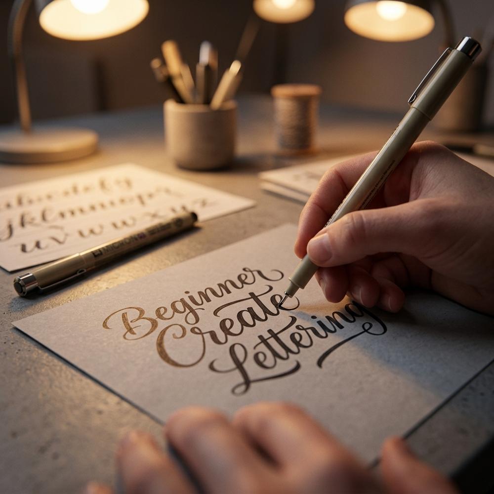
Fine-tipped pens filled with waterproof pigment ink, used to ink over a pencil sketch with crisp, even lines. Because the ink is archival and water-resistant, you can erase the pencil guides underneath or add a watercolor wash on top without smearing your outline. Beginners benefit from having more than one of the same nib on hand, since fine tips wear and a worn nib drags.
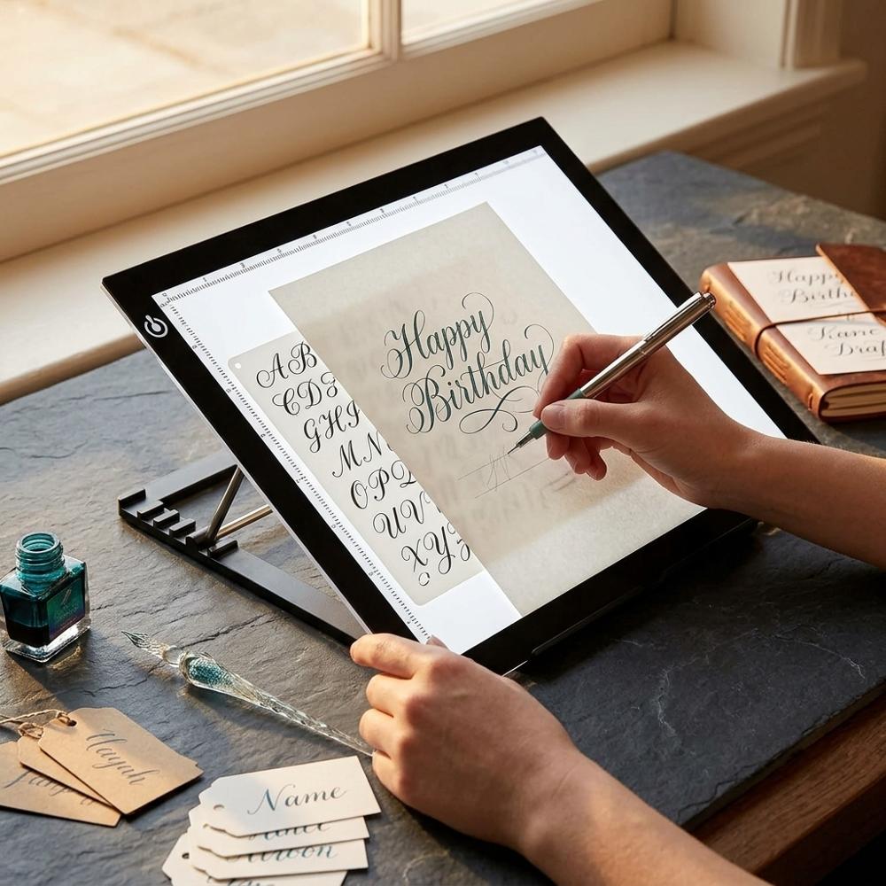
Transparent gridded ruler for drawing guidelines
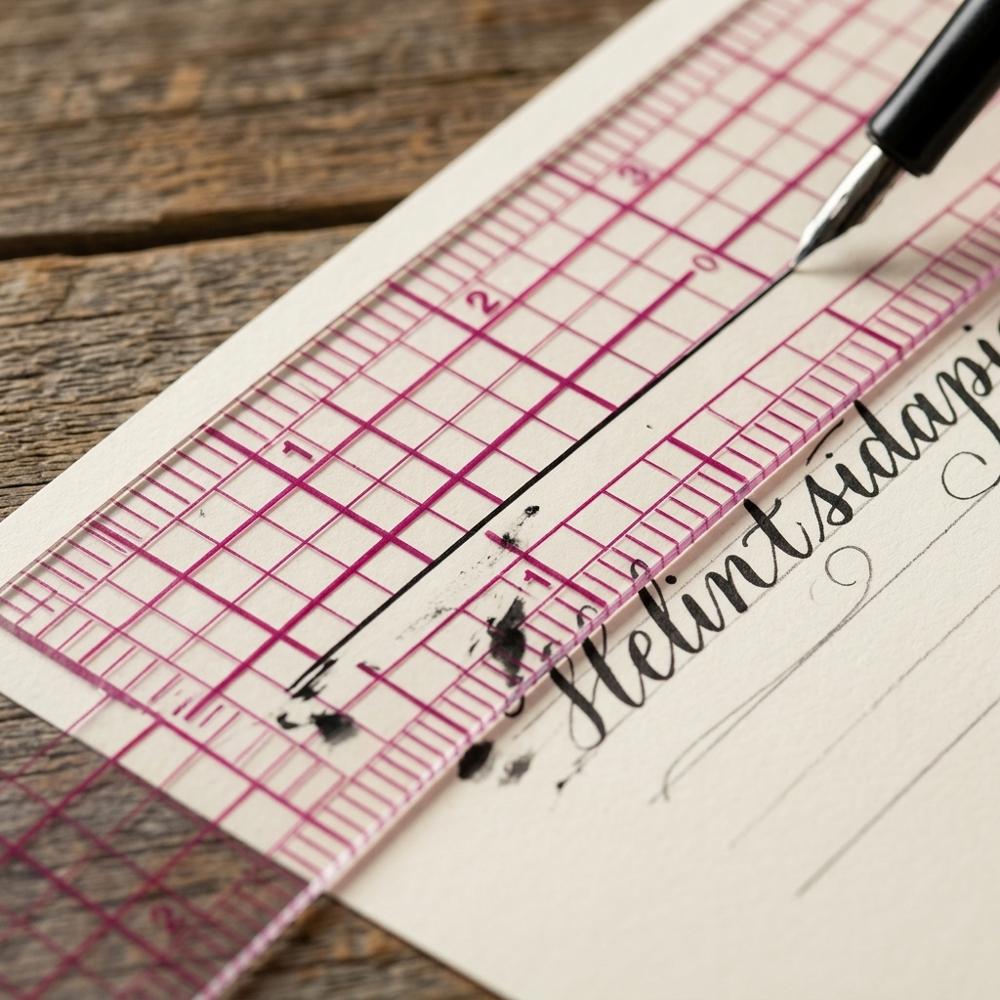
A clear plastic ruler printed with a fine grid rather than just an edge. The transparency lets you see your letters while you rule baselines, cap heights, and slant lines, and the grid helps you space those guides evenly. A short six-inch length is easier to control on small practice sheets than a long straightedge.
Together these five pieces are enough to letter a finished quote from blank page to inked result, which is more than most starter bundles can claim. If you find yourself drawn to the writing side of pens rather than the drawing side, a beginner fountain pen writing setup scratches a related but distinct itch, since fountain pens reward steady cursive over built-up letterforms. Keep your first sessions to a single pen and a stack of cheap paper, because the urge to add color usually arrives only once your strokes stop shaking, which is exactly what the next set of tools is for.
Adding Color and Refining What You've Started
Color is where most people assume hand lettering lives, but it is worth earning first, since flat black practice teaches stroke control far faster than chasing pretty gradients. Once your downstrokes are steady, the tools below open up blending, cleaner compositions, and longer practice sessions. If you discover you love the brush itself more than the illustrated letterforms, a focused beginner brush calligraphy setup leans harder into flowing script and is a natural next step. None of these are mandatory, and I would add them one at a time rather than all at once. Plenty of people also fold lettering into other paper hobbies, and the headers and trackers in a beginner bullet journaling setup are one of the most common places these new skills end up getting used.
Dual-tip color brush pens for blended lettering
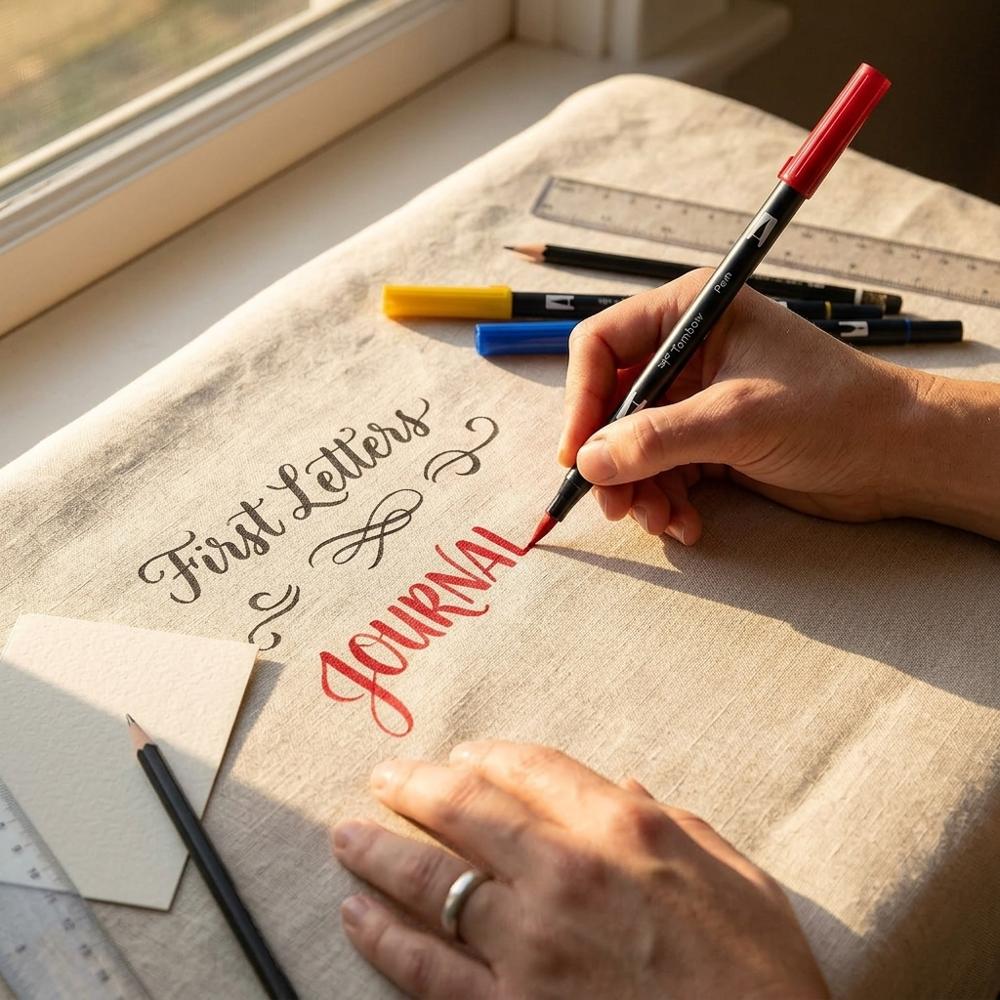
Markers with a flexible brush nib on one end and a fine tip on the other, filled with water-based ink in a range of colors. The brush end produces the same thick-and-thin strokes as a black brush pen, while the water-based ink lets you blend two colors into a gradient across a single letter. A curated set of ten is plenty to learn blending without the overwhelm of a hundred shades.
LED tracing light pad for refining lettering sketches
A slim, illuminated panel that lights a sheet of paper from below so you can trace a drawing placed underneath. In lettering it is used to redraw a rough sketch cleanly onto good paper, or to reuse a layout you like without measuring it again from scratch. Look for an even, adjustable brightness and a thin profile that sits flat on a desk.
Beginner hand lettering workbook with guided drills
A practice book that walks through basic strokes, alphabets, and small projects with traceable examples and room to copy them. Structured drills give a beginner a sequence to follow instead of staring at a blank page wondering what to practice. The better ones start with warm-up strokes before any full letters, which is the order skills actually build in.
Guideline practice paper with slant lines and dot grid
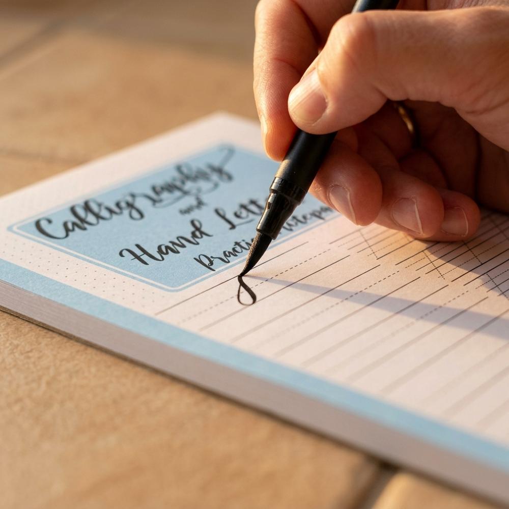
A pad of practice sheets printed with faint baselines, a consistent slant angle, and a dot grid to letter against. The pre-printed angle is the key feature: it trains your eye and hand to keep every letter leaning the same way, which is hard to judge by feel alone. Sheets like these are meant to be written on directly rather than traced.
Add these gradually and you will have a kit that takes you from steady black strokes to blended, composed pieces you would actually hang up or give away. If hand lettering turns out to be the gateway rather than the destination, it sits comfortably alongside the other low-cost, high-reward options in a roundup of the best starter hobbies for adults. The most common regret I hear isn't buying the wrong pen — it is buying ten of them before learning to control one.
Why Your Letters Look Off Even When You Followed the Tutorial
Why does my brush pen feel scratchy and start splitting after just a few pages?
Fraying almost always comes from the paper, not the pen — rough printer or sketch paper acts like sandpaper on the soft fibers of a brush tip and splays them within a session or two. Holding the pen straight up and down makes it worse by grinding the very point into the surface. Use smooth, marker-grade paper and keep the pen at roughly a 45-degree angle so the side of the nib does the work, and a single pen can last for months instead of days.
Why do my downstrokes come out the same thickness as my upstrokes?
Most beginners unconsciously hold steady pressure because they are afraid of damaging the tip, so every stroke lands at the same medium width and the lettering reads as plain handwriting. Brush pens are built to flex: light pressure on the way up, firm pressure on the way down, is the whole technique. Exaggerate the difference far more than feels natural at first, and once it is in your hand you can dial it back.
Why does my finished piece look messier than my warm-up scribbles?
This usually happens because people ink directly over a rushed pencil sketch, so every flaw in spacing and proportion gets traced permanently in pen. Treat the pencil stage as the real work: sketch loosely, fix the spacing, then refine, and for pieces that matter, redraw the clean version onto fresh paper rather than inking the messy original. Lettering is built up and corrected, not performed in one confident pass.
Why do my words drift uphill or bunch up at the end of a line?
Drifting baselines and cramped endings come from skipping guidelines and from not planning the whole word before starting. Without a ruled baseline the hand naturally angles upward, and without roughing out the spacing first you run out of room. Rule light guidelines every time and lightly mark where the word should end before you commit, then erase the lines after the ink dries.
Why should I stay in black for weeks before buying colors?
Color hides nothing and fixes nothing — a wobbly stroke inside a pretty gradient is still a wobbly stroke, and blending stacks a second skill on top of one you have not mastered. Beginners who jump straight to color sets often plateau because they are managing hue and water instead of pressure and consistency. Spend your first weeks on a single black pen; color is far more rewarding once the strokes underneath are solid.
Love what you see here? Save individual picks with ⋮ on any item, or copy the whole list to your own wishlist in one click — great for coming back to later, or dropping as a not-so-subtle hint.
 A Few More Beginner Setups We Carefully Put Together
A Few More Beginner Setups We Carefully Put Together
Beginner Knitting Setup: Needles, Yarn, and First Projects
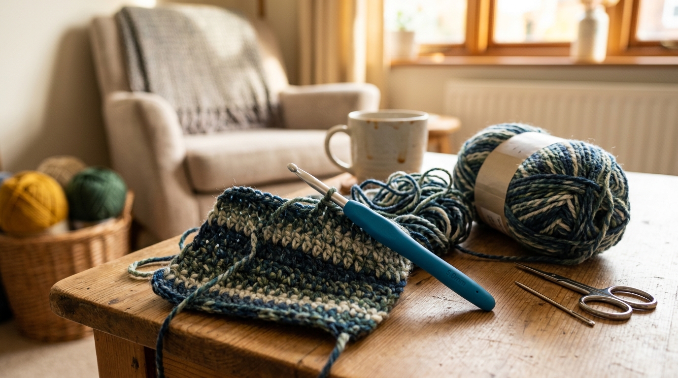
Beginner Crochet Setup: Hook, Yarn, and Starter Stitches
Disclosure: Some product links may be affiliate links. If you make a purchase through one of these links, we may earn a small commission at no extra cost to you.